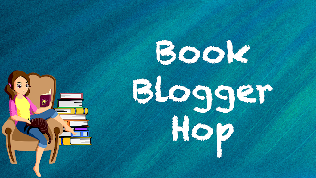
We are on to a new week for the Book Blogger Hop hosted by the lovely folks over at Ramblings of a Coffee Addicted Writer. This weeks questions is:
What is the significance of your blog header? (submitted by Elizabeth @ Silver's Reviews)
There really isn't much significance to my blog header other than I am a girl who likes to read books and has cats. I actually changed it here pretty recently when I started blogging again, because I realized that I no longer had access to some of the graphics I'd used previously for my headers if I were to decide to start new blog features, and that just wasn't going to work for me, so I started new. It's pretty basic and not nearly as interesting and pretty as a lot of people's but it works for me, because I'm pretty basic and not nearly as interesting and pretty as a lot of people. LOL.
What's the significance of your blog header? If you're stopping by from the linkup, please be sure to drop a link to your post below so I can stop by and pay you a visit. - Katie

I think mine was pretty simple way back when I first started. I legit have zero tech skills, especially anything graphic design related. Sadly those kinds of offerings weren't available when I was in school or I might have tried a basic one! Lol! The one I have came when I won a blog design contest from another blogger and that was probably 10 years ago by now! I go back and forth with whether or not I should get a new one done.
ReplyDeleteThanks for visiting my post!
My headers are just photos that I have taken and make a pretty image once they are cropped. I sometimes think about trying to do a custom book based one but like you, don't feel that I have the skills.
ReplyDeleteI like simple and basic too. I agree there are some really neat ones out there but I like mine simple and it's so me. Have a great week!
ReplyDeleteWhat more could a girl want than cats and books? Works for me! :-)
ReplyDeleteCats and books? Sounds just about perfect! My header is also pretty simple. Graphics aren't my strong suit, and I'm not terribly visually creative. I figure mine gets the point across, though. Thanks for stopping by my blog!
ReplyDeleteMIne was pretty basic as well before someone made a birthday gift of creating my blog theme, so I understand basic! Thanks for stopping by! Happy reading!
ReplyDeleteI'm a big science nerd and like stars gazing. I thought it would like my blog to look like its in outer space. From a design stand point basic is the way to go.
ReplyDeleteI like basic. It is clear and easy to read. Mine is pretty basic too - the standard stuff that Wordpress provides for free!
ReplyDeleteHave a great week.